The Winning Logo Design for the PCHblog Redesign
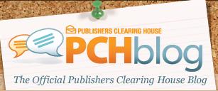
We’ve been busy over here at PCH working on improving many of our social media properties including the Publishers Clearing House Fan Page and PCHblog. We’re making quick progress on the PCHblog and I wanted to share a sneak peek of the winning design with you, our loyal readers, before the official re-launch. So here it is – a screen shot of the PCHBlog logo that won our hearts!
What do you think? As you can see, the new logo looks similar to the logos from PCHgames and PCHlotto. Our creative team used a Cork Board theme where all the features look as if they’re thumb tacked to a Cork Board. Pretty fun!
With the redesign, we’re also including a set of new features to make the PCHblog even easier to read and share. For example, you will now be able to search previous blog posts and see the Prize Patrol videos and pictures in one organized place. You can also read more about the writers and access many of our online properties directly from the PCHblog.
Don’t worry though; one thing that won’t change much is the type of articles that we post. Deborah, Dave, Elliot, Elaina and myself will continue to post plenty of fun PCH winner stories, Publishers Clearing House contest updates and general information about PCH.
Let us know what you think about the new logo!
Regards,
Frank @ PCH
PCH Community


